


evnow
Well-known member
Not sure how many of you check plugincars.com regularly. But, here was a cool range/soc graph that "Nick F" posted.
http://www.plugincars.com/sneak-peak-ford-focus-electric%E2%80%99s-dashboard-display-107267.html
Here is his explanation of it.
http://www.plugincars.com/sneak-peak-ford-focus-electric%E2%80%99s-dashboard-display-107267.html
Here is his explanation of it.
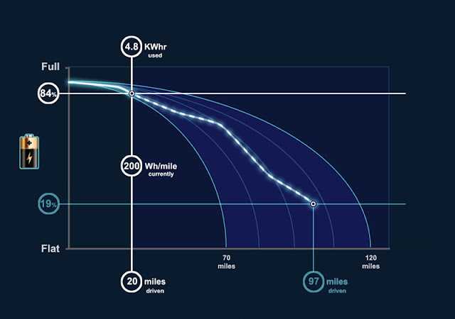
I got a bit bored near the end and didn't add all that i wanted so it could be improved upon. basically it's a graph with distance on the X axis and state of charge on the Y axis. a white vertical line moves along as the miles go by. on the line it shows your KW hours consumed, current watt hour consumption and the distance you have travelled.
There is a point on the graph showing where you are in miles travelled and in state of charge. Coming from that point are battery discharge curves. It's a bit hard to explain so have a look at the picture. The blue boundary represents the possible maximum and minimum range. If you drive at say 25mph (eg, 200 watt hours) you get the maximum range and if you drive at 80mph (eg, 400 watt hours) you get the minimum range. between these curves is the predicted discharge curve based on the route you have entered into the sat nav. It's wiggly because the route will have different roads with different speeds so energy consumptions. To the left of the white vertical line is a record of what you have done so far. it's supposed to be one wiggly line. Sorry, I didn't get around to correcting that bit. I suppose really it should show what you actually did versus what the prediction was.
I haven't quite finished it. The point is that the driver can see whether he/she is doing better than the prediction or worse and they can see the minimum and maximum range from where they are at that moment. It's also designed so that people get to understand that they don't have a set range. That range changes depending on the discharge level ie, how heavy your foot is and how fast your going.