


z0ner
Well-known member
ronnyguru said:I tweaked the M a bit.
Goal is to try to get it looking more like a Plug and try to de emphasize the center line.

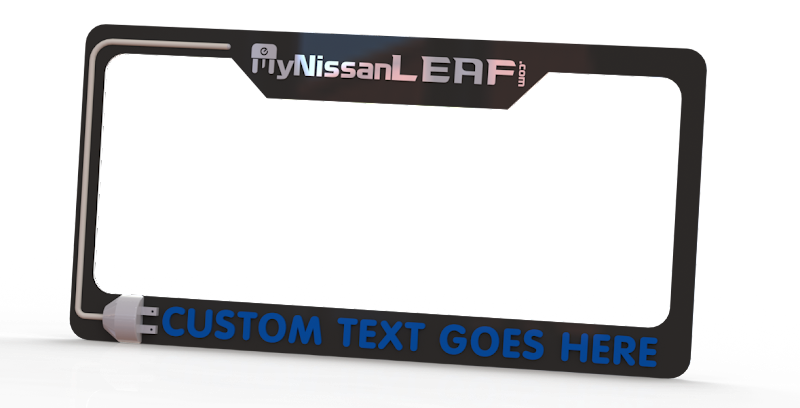
I really like this design. The 3D plug, de-emphasis on .com, everything. I vote for the sharp contrast and white/silver on black all around (instead of the CUSTOM TEXT in blue). Spot on and I'd order one immediately.