Range Chart

My Nissan Leaf Forum

Help Support My Nissan Leaf Forum:

This site may earn a commission from merchant affiliate links, including eBay, Amazon, and others.
TonyWilliams said:
Much like the regen issue, there are a lot of variables to make accurate predictions, which goes well outside what was started out as a simple one page chart..

Is that an apt comparison? Isn't gravity, fairly constant?

Highway design standards, though more variable, seem to tend to give very consistent results, close to 80% of ascent energy recovery, for me.

Ingineer's efforts, may give a lot greater resolution, in the future.

Still haven't seen anyone report the lower (50%) value, or the variability you show on the chart, Tony.

Have you seen those results?
 
edatoakrun said:
TonyWilliams said:
Much like the regen issue, there are a lot of variables to make accurate predictions, which goes well outside what was started out as a simple one page chart..

Is that an apt comparison? Isn't gravity, fairly constant?

Highway design standards, though more variable, seem to tend to give very consistent results, close to 80% of ascent energy recovery, for me.

Ingineer's efforts, may give a lot greater resolution, in the future.

Still haven't seen anyone report the lower (50%) value, or the variability you show on the chart, Tony.

Have you seen those results?

I did change the chart to reflect some variability, but again, as we've discussed ad nauseum, that exact same gravity affects a fully charged car at the top of a hill much differently than a lower state of charge. Regen is even variable between those two extremes, so neither is correct.

I'm always open to a simple, definitive way to cover the biggest variables. I used the variable data to reflect that there isn't one number.

In aviation, we actually do delineate between types of runway surfaces which is why it was brought up. There are HUGE variations in what can be done with each surface, and here in California, most of the major freeways are grooved concrete, while other roads are ungrooved asphalt.

I'm looking forward to getting my hands on a prototype LEAF SCAN, and getting closer to range nirvana.
 
TonyWilliams said:
I did change the chart to reflect some variability, but again, as we've discussed ad nauseum, that exact same gravity affects a fully charged car at the top of a hill much differently than a lower state of charge. Regen is even variable between those two extremes, so neither is correct...
Regen also varies with battery temp. I agree: it is hard to pin down how much one actually gets back. But I did manage 32 miles on about one fuel bar when doing 4000' down, 1000' up, 300' down, so it can be pretty significant.
 
dgpcolorado said:
Regen also varies with battery temp. I agree: it is hard to pin down how much one actually gets back.

Regen varies with SOC, battery temp, mode selected (Eco or D), about a zillion parameters on how fast you hit the brakes (sudden application can result in no regen), how steep the hill is and your speed on that hill, and probably a few others that are not popping to mind.

Of course it is significant; it can also be real close to zero.
 
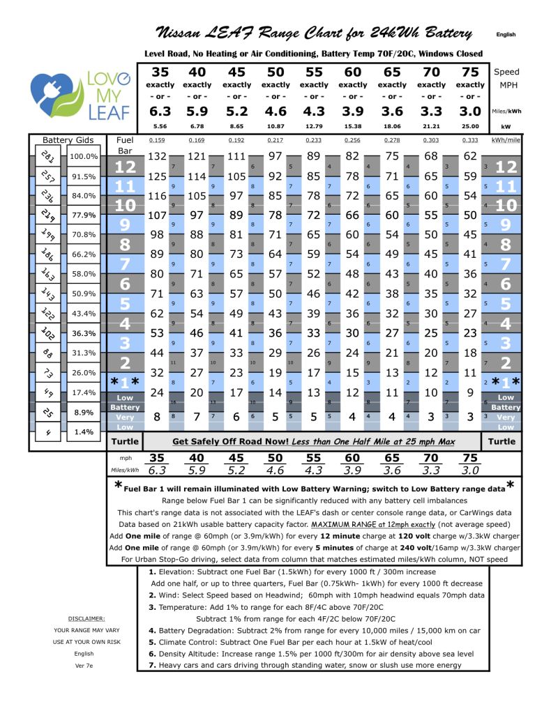
With Tony's permission I have reproduced his range chart in Excel format. You can enter parameters like temperature, climate control use, odometer mileage. The spreadsheet then automatically makes the adjustments Tony suggests saving time and mental arithmetic.

I provide both Excel and Google docs versions.

Read more on my blog at http://wp.me/p1sK3k-9B

Feel free to make suggestions on improvements to the spreadsheet. Some of the adjustments were difficult to implement. I may find a way later.

TonyWilliams said:
LEAFrangeChartVersion7e.jpg
 
JPWhite said:
TonyWilliams said:
I can offer the math I wrote for density altitude for the LEAF Energy iPhone/iPad app, but not sure I saved it.

That would be cool if you can dig it out.

I'll have to try the app on my wife's phone. She has an iPhone, I'm android.

If you are using the NWS formula, note that there is no elevation entry, which means the pressure has to be the "elevation". That means you have to use the actual pressure. For a 5000 foot elevation "E", the actual standard pressure is 29.92 - ( E / 1000 ) = 24.92

Of course, you can import the reported pressure in place of 29.92 for more accuracy.

P = pressure in inches
T = temperature in F

Density Altitude = 145442.16 * [ 1 - {{ 17.326 * P} / {459.67 + T }} ^0.235 ]

P = 29.92 inches, standard at sea level
T = 59 fahrenheit, standard at sea level

DA = 145442.16 * 1 - {518.39392 / 518.67} ^0.235

DA = 145442.16 * 1 - 0.99946772 ^ 0.235

DA = 145442.16 * 1 - 0.99987488872

DA = 145442.16 * 0.00012511

DA = 18.1964541 feet, so that checks OK

*********************************************

P = 24.92 inches, standard at 5000 feet
T = 41 fahrenheit, standard at 5000 feet ( 15C at sea level minus 2C per 1000ft )

DA = 145442.16 * 1 - {431.76392 / 500.67} ^0.235

DA = 145442.16 * 1 - 0.86237226 ^ 0.235

DA = 145442.16 * 1 - 0.965802

DA = 145442.16 * 0.03419762

DA = 4973.77517 feet. So that checks, too
 
JPWhite said:
With Tony's permission I have reproduced his range chart in Excel format. You can enter parameters like temperature, climate control use, odometer mileage. The spreadsheet then automatically makes the adjustments Tony suggests saving time and mental arithmetic.

I provide both Excel and Google docs versions.

Read more on my blog at http://wp.me/p1sK3k-9B

Feel free to make suggestions on improvements to the spreadsheet. Some of the adjustments were difficult to implement. I may find a way later.

JP,

I think the Average Economy is very useful in addition to the Speed at the top of the range chart. Since speed is actual speed (not average) it's more difficult to keep consistent unless you're on a long stretch.

I feel like that would be a good addition to your spreadsheet.
 
TNleaf said:
JPWhite said:
With Tony's permission I have reproduced his range chart in Excel format. You can enter parameters like temperature, climate control use, odometer mileage. The spreadsheet then automatically makes the adjustments Tony suggests saving time and mental arithmetic.

I provide both Excel and Google docs versions.

Read more on my blog at http://wp.me/p1sK3k-9B

Feel free to make suggestions on improvements to the spreadsheet. Some of the adjustments were difficult to implement. I may find a way later.

JP,

I think the Average Economy is very useful in addition to the Speed at the top of the range chart. Since speed is actual speed (not average) it's more difficult to keep consistent unless you're on a long stretch.

I feel like that would be a good addition to your spreadsheet.

If I understood you correctly, I've made the adjustments to the spreadsheet.

Thanks so much for your input/ideas.
 
I tend to process graphs better than tables. If that's your cup of tea also, here's the range chart as a graph. I like that you can easily see the different "thickness" of the bars. It's easy to think of 4 bars as "run down", but really almost half of your range is there.

Thanks Tony for all of your work.
 
Nubo said:
I tend to process graphs better than tables. If that's your cup of tea also, here's the range chart as a graph. I like that you can easily see the different "thickness" of the bars. It's easy to think of 4 bars as "run down", but really almost half of your range is there.

Thanks Tony for all of your work.

Great chart. It does make it clear that Nissan have taken range out of the first bar and added it into the LB bar. I suppose this discourages folks from running out of electric and subsequently doesn't run the battery too low on a regular basis protecting the battery from over discharge. At the LB warning (which sometimes comes during bar 1) you have about 20% left. That makes me feel better about getting the low battery warning and not harming my battery at all. I rarely get as low as bar 2.
 
Herm said:
Very nice Nubo, much easier to visually process
+1!

JPWhite said:
Great chart. It does make it clear that Nissan have taken range out of the first bar and added it into the LB bar. I suppose this discourages folks from running out of electric and subsequently doesn't run the battery too low on a regular basis protecting the battery from over discharge. At the LB warning (which sometimes comes during bar 1) you have about 20% left. That makes me feel better about getting the low battery warning and not harming my battery at all. I rarely get as low as bar 2.
I think bar 1 appears thin because LBW overlaps bar 1. I don't think I've ever had an LBW unless bar 1 was still visible. It makes sense to put that area in the LBW "bar" because that's the critical number when the SOC gets that low. It's hard to miss the Low Battery Warning.
 
It would be nice if the x and y numeric axis lines continued through the colored bars to make the actual numbers for each location more easily descernable.

Nubo said:
I tend to process graphs better than tables. If that's your cup of tea also, here's the range chart as a graph. I like that you can easily see the different "thickness" of the bars. It's easy to think of 4 bars as "run down", but really almost half of your range is there.
 
TomT said:
It would be nice if the x and y numeric axis lines continued through the colored bars to make the actual numbers for each location more easily descernable.

I agree. Couldn't find a way for Excel to put gridlines over the series. I played around with simply drawing horizontal lines across, but with the sloping series I found it oddly distorted the visual presentation with an optical illusion and appeared confusing. I'll keep noodling with it. Maybe some subtle banding with neutral transparencies would give just enough guidance without confusing the eye..
 
Nubo said:
I played around with simply drawing horizontal lines across, but with the sloping series I found it oddly distorted the visual presentation with an optical illusion and appeared confusing.
I agree. I think the ideal display would be to have the vertical lines only, but with hash marks on them. That will almost certainly require an overlay.

Ray
 
As the battery capacity decreases, these "bars" are no longer accurate. A full bar will represent less "fuel" and thus less range.

Do you have a capacity (or percent of "new" capacity) parameter?

If you label the lines between the bars with the corresponding GID value (and percent), the chart could still be used even when the capacity is diminished.

How about a version with no color, just the lines between the bars (the iso-GID bars), for those with only black-and-white printers?

Good work.
 
Looks awesome!

One feature request. I'm contemplating a 76 mile excursion but really need to know the round trip numbers. Even just being able to add one waypoint for a "there and back" calculation would be really cool. I can enter the same start and end point then edit the distance which works OK, but I have to use another source to compute the distance.

But very useful! Looks like I can do it if I drive 60 and it isn't too hot. With that knowledge and no desire to be the slow guy on an open 70mph highway, I may take the ICE unless I can be assured of some destination or "while eating" charging on the way back. Probably too soon in my experience to cut it that close. We'll see how I feel in two weeks (and if the DeSoto QC station will be working and not too off the path to be helpful)
 
Back
Top